the_empire_blog
In previous post we introduced a basic UI framework, which allowed us to define UI of a button declaratively. To figure out what is our next step, we check the rendered app:
Notice bottom menu has 2 buttons, aligned to the left. In order to build it declaratively, the UI framework must be able to:
- render a collection of UI items horizontally
- render a button buttons inside collections
- align UI items in various ways
And that is our plan for today.
UI::Horizontal
We are going to borrow several concepts from SwiftUI. We are going to introduce a UI::Horizontal component, which will do the following:
- It will be a UI::Item
- It will accept a collection of children, and render them horizontally, left to right
- It will accept a parent and be rendered through
UI::Box
But first…
UI::Collection
UI::Horizontal and UI::Box will be similiar in many ways:
- They accept a block, which define children components through (at least partially) unified interface
- They will be responsible for repositioning of own children under some circumstances
These 2 components share enough features, that we can name a concept they represent: they are a collection components. We will express what that means with a module:
# src/lib/ui/containers/_collection.cr

module UI
  module Collection
    # We expect collection components to implement these 2 methods
    abstract def add_renderable(renderable : UI::Item)
    abstract def reposition_renderable!

    # And all collection components will be able to use `text` as a child
    def text(**args)
      text = UI::Text.new(self, **args)
      add_renderable(text)

      text
    end
  end
end
Off-screen, we easily update UI::Box to include this new module.
But there are also differences between UI::Box and that new component, so let’s explore them now:
UI::Horizontal again
I will once again just dump the final implementation and explain along the way:
# src/lib/ui/containers/horizontal.cr

module UI
  class Horizontal
    # This should be clear, UI::Horizontal is both an item and a collection
    include UI::Item
    include UI::Collection

    # We will store multiple UI::Item as renderables
    @renderable : Array(UI::Item) = [] of UI::Item
    # Plan is to create this component as a child of UI::Box, so we'll store parent like other components do
    @parent : UI::Collection
    @position : Tuple(Int32, Int32)

    def initialize(@parent, gap = 20, &block : UI::Horizontal -> )
      # We must expose our bounding box, but we will do it differentely this time.
      # Position is governed by the parent, so we'll just save it to a variable
      @position = {@parent.bounding_rectangle.left, @parent.bounding_rectangle.top}
      # This represents the gap between individual child components. We default it to 20, but allow setting any
      @gap = gap

      # UI::Box does the same. Accept a block during initialization, call it in here
      block.call(self)
    end

    # While @position is strictly set by parent, width and height depend only on the children.
    # Since we will be stacking children horizontally, our width is sum of all widths + gaps between the components
    def width
      @renderable.sum(&.bounding_rectangle.width) + (@renderable.size - 1) * @gap
    end

    # And our height is that of the heighest child
    def height
      @renderable.max_of?(&.bounding_rectangle.height) || 0
    end

    # Unlike other components, we will not cache bounding rectangle. We'll calculate it every time.
    def bounding_rectangle : SF::IntRect
      SF::IntRect.new(@position[0], @position[1], width, height)
    end

    # Update your position, update the children
    def position=(new_position)
      @position = new_position
      reposition_renderable!
    end

    # Similiar to UI::Box, but deal with an array of renderables.
    # call `super`, which draws the background, then draw each renderable
    def draw(target : SF::RenderTarget, states : SF::RenderStates)
      super(target, states)

      @renderable.each do |item|
        target.draw(item, states)
      end
    end

    # Once again, similiar to UI::Box
    # Delegate event to children, let them decide how to handle
    def handle_event(event : SF::Event)
      @renderable.each do |item|
        item.handle_event(event)
      end
    end

    # In UI::Box we set our single renderable to argument
    # Here we push it to `@renderable` array and reposition
    def add_renderable(renderable : UI::Item)
      @renderable.push(renderable)
      reposition_renderable!
    end

    # This is the heart of the component
    def reposition_renderable!
      @renderable.each_index do |i|
        case i
        when 0
          item = @renderable[i]

          x_position = @position[0]
          y_position = @position[1]

          # For first child, set it's position exactly to own top-left corner
          item.position = {x_position, y_position}
        else
          item = @renderable[i]
          previous_item = @renderable[i - 1]

          x_position = previous_item.bounding_rectangle.left + previous_item.bounding_rectangle.width + @gap
          y_position = @position[1]

          # For every next child, render it at the same height,
          # but `@gap` pixels to the right from where the previous one ended
          item.position = {x_position, y_position}
        end
      end
    end
  end
end
Now, we need to be able to call it somehow. We’ll extend the UI::Collection:
# src/lib/ui/containers/_collection.cr, module UI::Collection

def horizontal(**args, &block : UI::Horizontal -> )
  horizontal = UI::Horizontal.new(self, **args, &block)
  add_renderable(horizontal)

  horizontal
end
That should should do the trick. Now we just need to update the…
UI::Button
We already have UI::Button, but it is not UI::Item. This is easily fixable by replacing include SF::Drawable with include UI::Item and implementing the missing methods.
Second issue is that it must accept a @parent, but that is also trivially done. I will do all of these changes off-screen.
Third issue is that we must be able to create it as a child of UI::Collection, which is easy enough:
# src/lib/ui/containers/_collection.cr, module UI::Collection

def button(**args)
  button = UI::Button.new(self, **args)
  add_renderable(button)

  button
end
New TheEmpire::BottomMenu
With these additions, we can rewrite the UI for bottom menu with our framework! We are going to rewrite most of the file, buckle up:
# src/the_empire/bottom_menu.cr

class TheEmpire
  class BottomMenu
    include SF::Drawable

    @modes : Array(TheEmpire::Mode::BaseMode)
    @active_mode : TheEmpire::Mode::BaseMode
    @omit_event : Proc(TheEmpire::Event, Nil)
    @ui : UI::Item # <- Replacing an array of buttons with UI object

    def initialize(position, size, @modes, @active_mode, @omit_event)
      @bounding_rectangle = SF::IntRect.new(position[0], position[1], size[0], size[1])
      @ui = build_ui() # <- Replacing definition of buttons with the UI object
    end

    # This is much simpler now. Just render the @ui object
    def draw(target : SF::RenderTarget, states : SF::RenderStates)
      target.draw(@ui)
    end

    # this is also much simpler. Just delegate all events to @ui
    def handle_event(event : SF::Event)
      @ui.handle_event(event)
    end

    # And this is todays hero.
    private def build_ui
      # Define a `UI::Box` over the entire available area
      UI::Box.new(@bounding_rectangle) do |c|
        # define a `horizontal` as its child
        c.horizontal do |c|
          # loop over the @modes
          @modes.each do |mode|
            # For each mode define a button
            c.button(
              size: {200, 80},
              text: mode.button_text,
              on_click: ->{
                event = TheEmpire::Event::ChangeModeEvent.new(mode)
                @omit_event.call(event)
              },
              active: mode == @active_mode
            )
          end
        end
      end
        .background(fill_color: Constants::COLOR::MENU::BACKGROUND) # <- And give the whole UI::Box a background
    end
  end
end
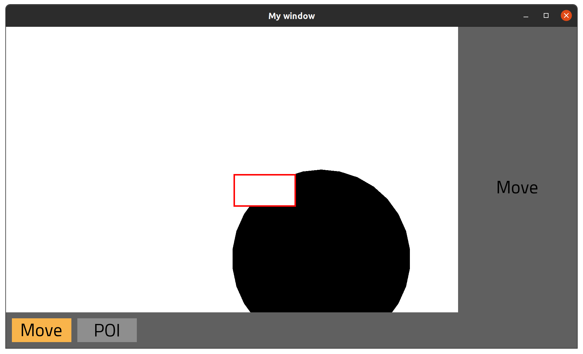
And with all this laborious experiments we get this:
And it works like a charm! Nothing changed visually, but…
Actually it did change visually. We kind of asked it to. The Horizontal is considered as wide and heigh as the 2 buttons, and UI::Box centers it. This makes the buttons be centered in the bottom menu. What we want is for them to be aligned to the left. We’ll achieve that with another idea taken from the SwiftUI, the…
UI::Spacer
It role of a spacer is to fill in all available space. The idea (for horizontal spacer) is as follows:
- We analyze how much width we have available. Lets say it is 1000 pixels.
- We analyze how much width do all non-spacer components take. Let’s say that is 200 pixels.
- We analyze how much width is left, still available.
- If there are no spacer components in the
UI::Horizontal, this is the end of the story - If there are spacer components, we distribute the remaining width between them.
So, for the scenario above, if there is 1 spacer, we will give it a width of 800, if there are 2, we will give each of them 400 width, and so on. Their only role is to fill available space. This will allow us to strategically position the non-spacer components as we wish.
In particular, if we add a spacer at the end of our buttons list, it should push the buttons to the left. So, how wide will a single spacer be?
# src/lib/ui/containers/horizontal.cr, class UI::Horizontal

# calculte how much width does a single child spacer have
def spacer_width
  # how many spacers do we have?
  spacers_count = @renderable.select(UI::HorizontalSpacer).size
  # how much width do all the non-spacers take?
  non_spacers_width = @renderable.reject(UI::HorizontalSpacer).sum(&.bounding_rectangle.width) + (@renderable.size - 1) * @gap
  # take full parent width, take away width of own non-spacers, and divide by how many spacers we have
  # this is how wide a single spacer child is
  (parent.bounding_rectangle.width - non_spacers_width) / spacers_count
end
The code above depends on UI::HorizontalSpacer objects. It’s implementation is actually very simple:
# src/lib/ui/horizontal_spacer.cr

module UI
  class HorizontalSpacer
    include UI::Item

    @parent : UI::Horizontal
    @position : Tuple(Int32, Int32) = {0, 0}

    def initialize(@parent)
    end

    def position=(new_position)
      @position = new_position
    end

    def height
      0
    end

    def width
      @parent.spacer_width
    end

    def bounding_rectangle : SF::IntRect
      SF::IntRect.new(@position[0], @position[1], width.to_i, height)
    end
  end
end
Finally, inside UI::Horizontal we allow inserting one into children:
# src/lib/ui/containers/horizontal.cr, class UI::Horizontal

def spacer
  spacer = UI::HorizontalSpacer.new(self)
  add_renderable(spacer)

  spacer
end
Notice we are not putting it into the UI::Collection. UI::Box doesn’t need spacers, and UI::Vertical, which we will implement later, will have it’s own, UI::VerticalSpacer.
Now that we have it, we can use it inside the bottom menu:
# src/the_empire/bottom_menu.cr, class TheEmpire::BottomMenu

private def build_ui
  UI::Box.new(@bounding_rectangle) do |c|
    c.horizontal do |c|
      @modes.each do |mode|
        c.button(
          size: {200, 80},
          text: mode.button_text,
          on_click: ->{
            event = TheEmpire::Event::ChangeModeEvent.new(mode)
            @omit_event.call(event)
          },
          active: mode == @active_mode
        )
      end
      c.spacer # <- this is new
    end
  end
    .background(fill_color: Constants::COLOR::MENU::BACKGROUND)
end
And voila:
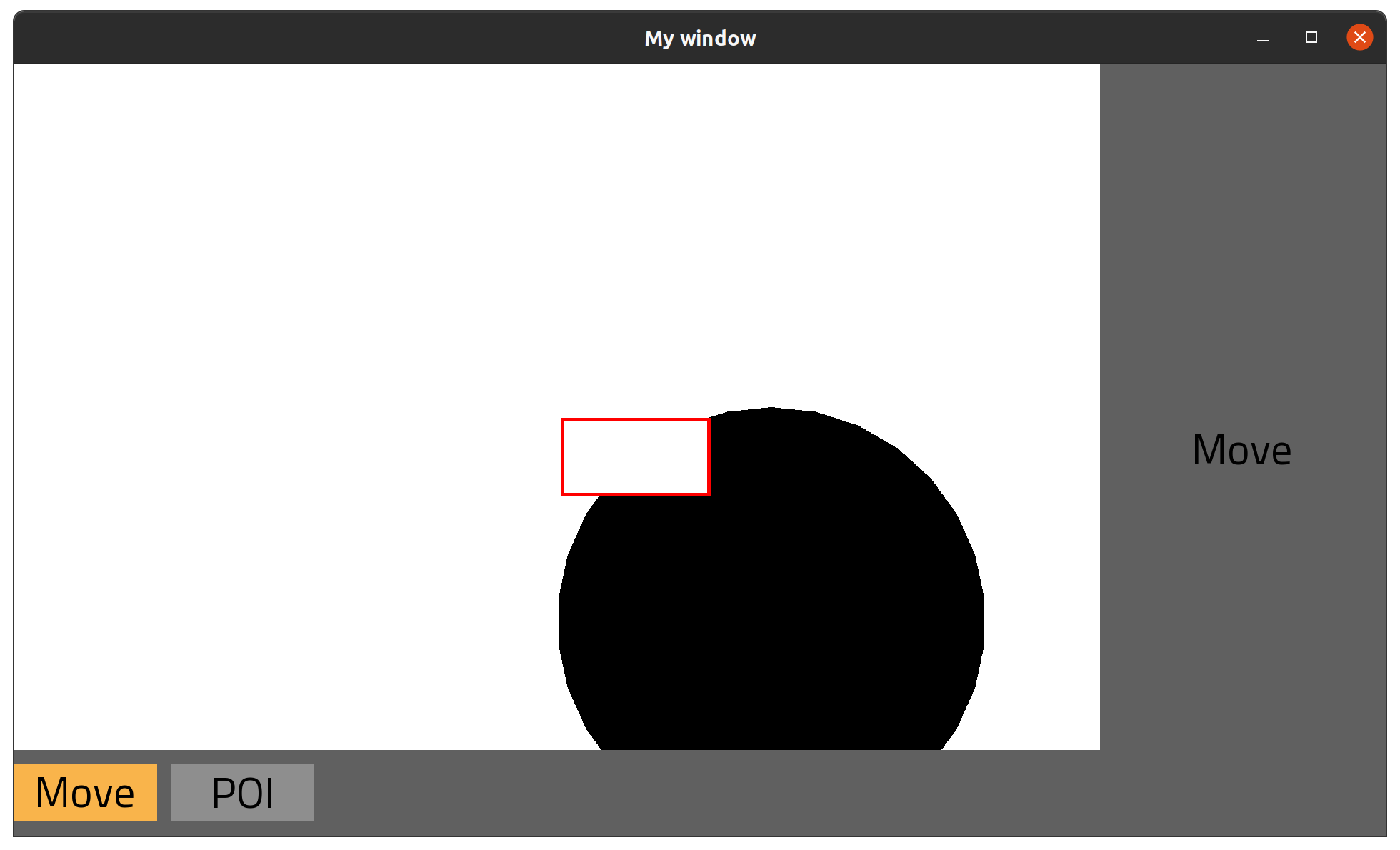
Not only did we implement important architecture, we changed visuals as we wanted! For reference, this would be the result if we put the spacer in the beginning of horizontal:
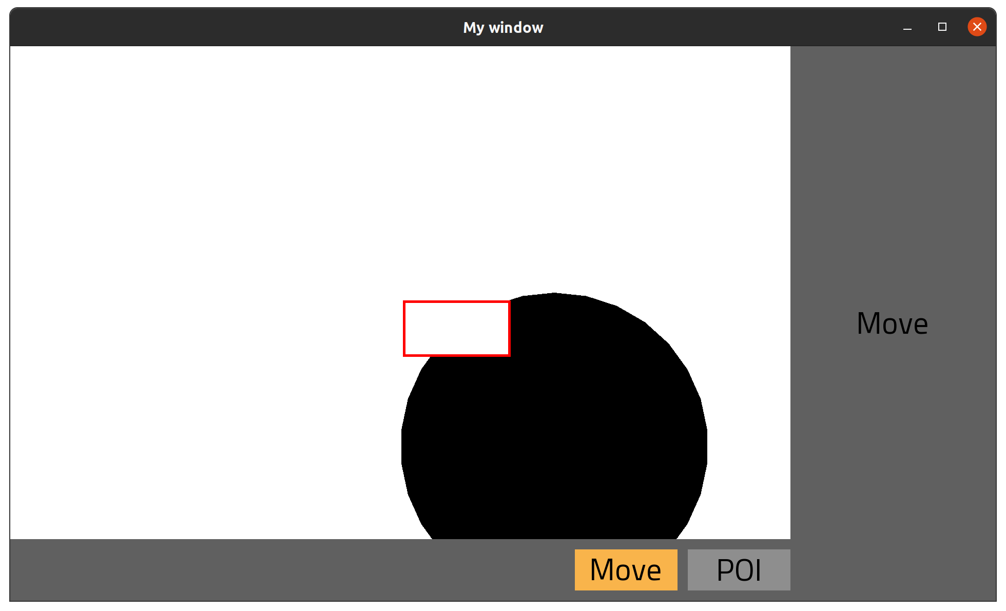
And if we put one in the end, one in the beginning, and one between the buttons:
We can now position elements within collections.
One remaining issue is this: buttons are aligned all the way to the end of screen, which doesn’t look to great. It is easy to understand why that happens: if there is a spacer, it fills entire space provided by the parent. We need some sort of padding. A collection component should be able to define it’s padding, and that would make bounding box available for the children smaller.
Padding
We’ll add new abstract method to collection, and it will represent that smaller bounding rectangle:
# src/lib/ui/containers/_collection.cr, class UI::Collection

abstract def children_bounding_rectangle : SF::IntRect
There are now 2 rectangle-returning methods in our architecture:
bounding_rectangle, which defines components own space on screenchildren_bounding_rectangle, which defines area available for components children.
For the UI::Horizontal, we will keep it simple:
# src/lib/ui/containers/horizontal.cr, class UI::Horizontal

def children_bounding_rectangle : SF::IntRect
  @parent.children_bounding_rectangle
end
UI::Horizontal doesn’t need padding for now, so we’ll just say it’s #children_bounding_rectangle is whatever the parent has.
For UI::Box, however, we will hardcode a padding:
# src/lib/ui/containers/box.cr, class UI::Box

def initialize(@bounding_rectangle, &block : UI::Box -> UI::Item)
  @renderable = nil
  @padding = 20 # <- This is new. Hardcode it's value, no need to configure it.

  block.call(self)
end

# Calculate new bounding rectangle based on the `#bounding_rectangle` and `@padding`
# it starts `@padding` pixels to the left the bottom,
# and is `2 * @padding` narrower and shorter
def children_bounding_rectangle : SF::IntRect
  top = bounding_rectangle.top + @padding
  left = bounding_rectangle.left + @padding
  width = bounding_rectangle.width - 2 * @padding
  height = bounding_rectangle.height - 2 * @padding

  SF::IntRect.new(left, top, width, height)
end
Our calculation of how much width do spacers get must be also updated:
# src/lib/ui/containers/horizontal.cr, class UI::Horizontal

def spacer_width
  spacers_count = @renderable.select(UI::HorizontalSpacer).size
  non_spacers_width = @renderable.reject(UI::HorizontalSpacer).sum(&.bounding_rectangle.width) + (@renderable.size - 1) * @gap

  # This is new. It now takes `children_bounding_rectangle.width` instead of `@parent.bounding_rectangle`.
  (children_bounding_rectangle.width - non_spacers_width) / spacers_count
end
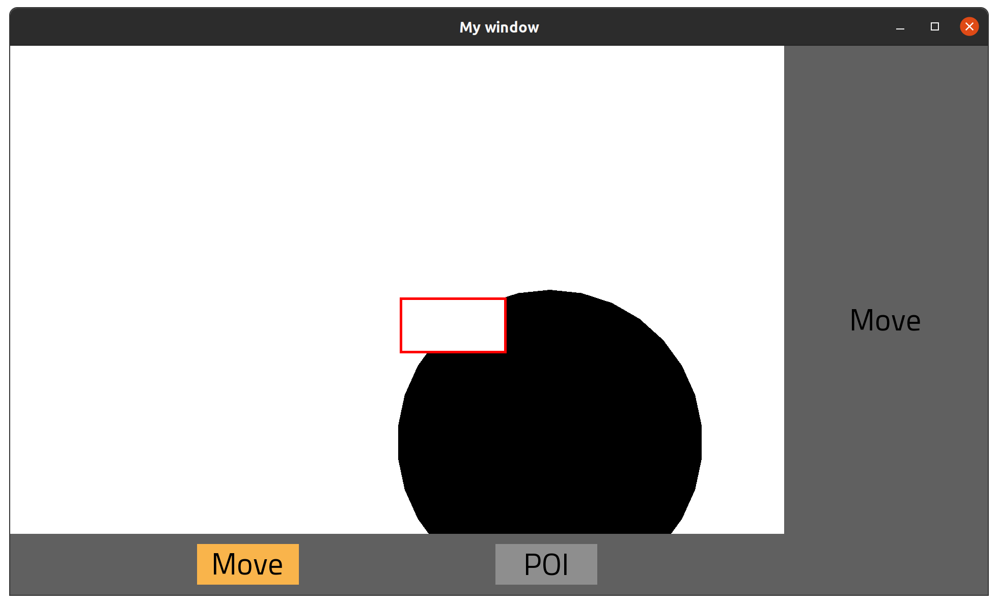
That’s much better:

UI::Vertical
We mostly focused on the horizontal component today, but vertical is nearly a copy-paste. Differences include:
- in
#reposition_renderable!, instead of repositioning children left-to-right, it will reposition them top-to-bottom #widthand#heightcalculation, which are logically reversed (compared to vertical)- it will have a
UI::VerticalSpacercomponent, which should fill in height instead of width
Since it is quite trivial, I’ll implement it off-screen.
Once we have it, we can now do this as a bonus:
# src/the_empire/mode/move_mode.cr, class TheEmpire::Mode::MoveMode

def right_menu(bounding_rectangle : SF::IntRect)
  UI::Box.new(bounding_rectangle) do |c|
    c.vertical do |c|
      c.horizontal do |c|
        c.text(string: "Move")
        c.spacer
      end
      c.spacer
    end
  end
    .background(fill_color: Constants::COLOR::MENU::BACKGROUND)
end
We update the #right_mode for our modes. Instead of rendering the text in the middle of a box, we put it in both a vertical and horizontal, and put a spacer at the end of both.
It will align the text to the top-left:

And that’s it for today! In next one, we will be take a small detour and introduce the main menu!